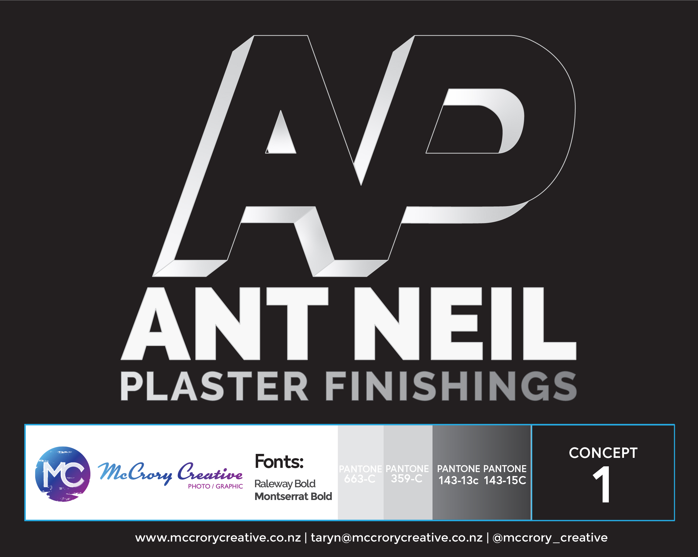
Anthony from Ant Neil Plaster Finishings came to me to help him design a logo for a specific purpose. I can’t wait to see the purpose in fruition. (Hint, it’s going to be cool!)
THOUGHTS BEHIND THE DESIGN
- The 3D Extrusion of the font is representative of the plasterers flat and smooth strokes and the sharp plastered corners.
- The logomark is ANP combined.
- The colours are sampled from a plastered wall.
- The gradients represent the Plaster Finishing nature of Anthony’s work.
Thank you, Anthony, for choosing McCrory Creative to help problem-solve this logo design with you.
