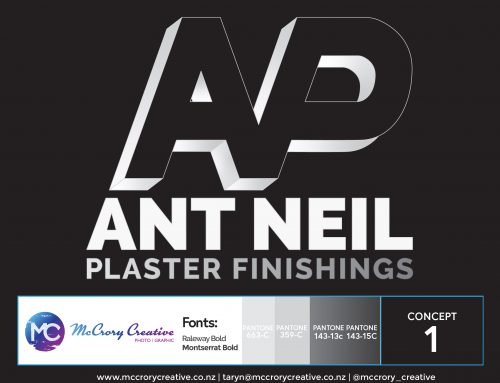
Emon and Rose from EP Master Plaster LTD contacted me to update their branding. They still wanted to keep some elements from their previous logo for continuity. I removed the background on the plasterer icon and outlined the image in Illustrator to make it a vector image to make it easy to size and print correctly. I also added glasses for a personal touch, as Emon wears glasses. I used a strong font with serifs to establish trust, dependability, a sense of history and tradition.
For SMOOTH OPERATOR I used a serif free font to imply modernity and also and bit of humour. Smooth Operator, get it… :D
The colours, of course, are Taranaki’s amber and black!
They loved it.
Contact EP Master Plaster LTD for all your plastering needs and also follow on Facebook :D

